
Case Study: Network visualization with data from a 360° feedback – often wasted potential!
I assume that the reader of this paper knows the 360-degree method (also known as: multi-source feedback or management feedback). Reported is an authentic case. A total of 128 people participated as feedback receivers. Several thousand questionnaires were filled from the perspective of employees, superiors, colleagues and customers.
It lies within the nature of things that most feedback recipients at a company-wide implementation are also feedback providers to others, when other feedback recipients ask for their feedback as colleagues or as (internal) customers. The result is a complex network graph.
Visualization
First I show how the complex network „who gives feedback to whom“ can be visualized with R. Don´t be scared, I start with the confusing end result. The following chart shows the resulting network graph.
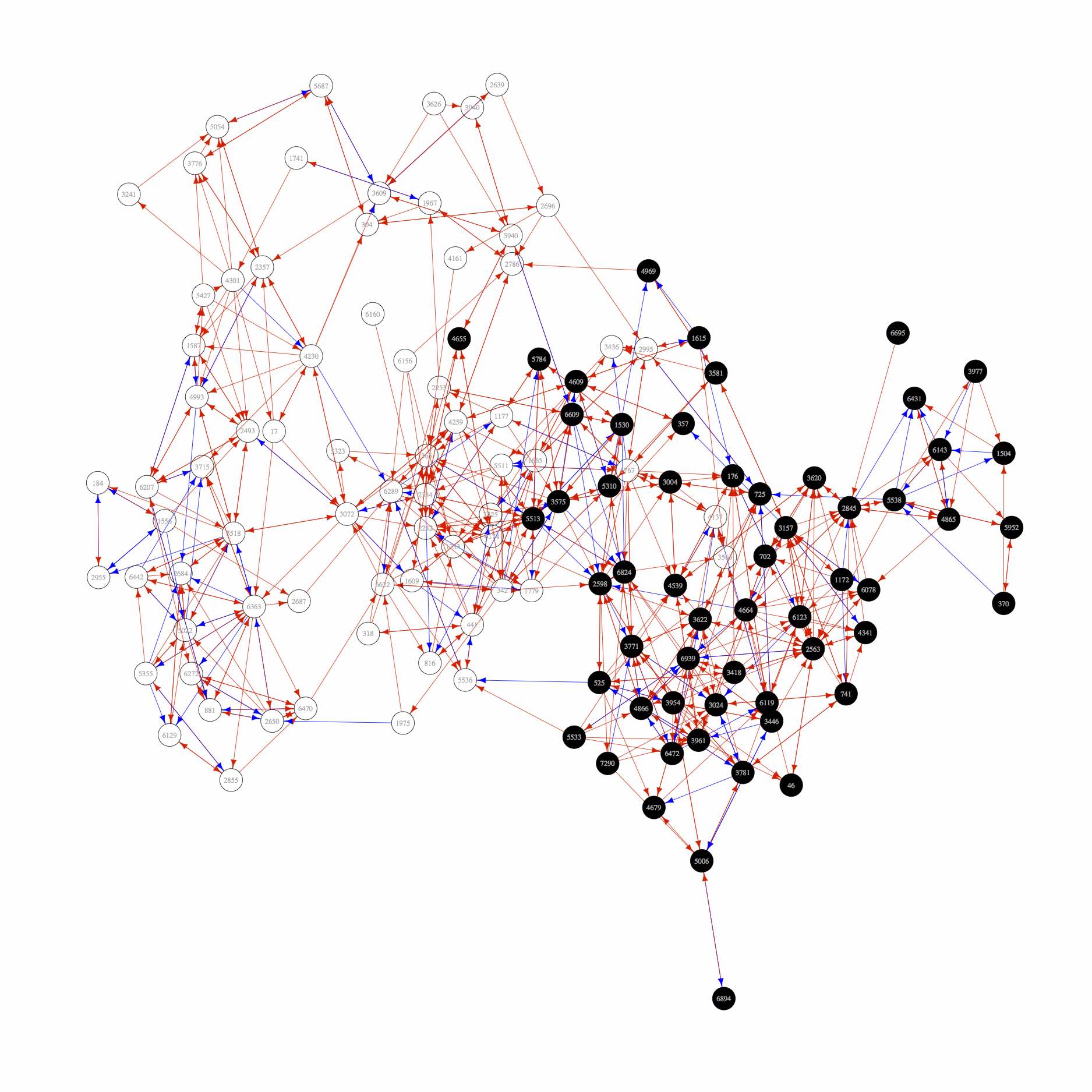
360° Feedback Network Analysis (Perspective: Peers)
The wild tangle of circles represent the total of 128 recipients of the 360° feedback implementation. The black circles represent the employees of a particular department, while the rest of the company is shown as white circles. The connections between the circles are directed (-> arrows) and tell us, who gives whom feedback. Red Arrows show collegial feedback and blue arrows signify feedback from a customer´s perspective.
Perfect basis for organizational or sector development
While 360-degree results are normally used for personal development processes, the use for organizational or sector development is rare. An evaluation of the diagram above I did not know. A few thoughts on this …
(A) Identification of well networked people in the company: people whose feedback is asked most often, are not automatically in key positions. They are perhaps due to their personality and their behavior trusted sparring partners and as defined by Kotter (1995) for each process of change is an important member of a strong leadership coalition. I contend that this „unofficial“ function of these people is often unknown to the top management.
(B) Feedback culture as „SMART Goal“: I should not have to mention the huge importance of a qualified feedback for the personal development of each leader. Any professional manager should have based on peer-level at least a handful of colleges (and internal customers) to act for him as a corrective. The chart reveals that this in this example is by far not always the case. A specific goal for the future might be to increase the overall number of arrows (currently 672) by 20%.
(C) Comparison between the organization and „living“ structure: For example, after a restructuring the existing structures will more or less continue to exist in the hidden. A successful restructuring process should be obviously shown after some time in the above graphic. Apparent discrepancies are a cause and approach to intervention.
How to create the graph: R-Script
Finally, I would like to explain how the graph shown above has been generated. I use demo data (data.txt) because I was not allowed to publish the original data. The script generates a reproducible and simplified result.
raw <- read.delim("https://holtmeier.de/public/360.csv")
FE <- unique(raw$FEID) #vector of feedback receipients
matrix360 <- matrix(0,length(FE),length(FE)) #matrix, filled whith zeros
for (i in 1:length(FE)) { #Feedbacks are coded by "1"
matrix360[i, which(FE %in% subset(raw, raw$FEID == FE[i])$FGID)] <- 1
}
require(igraph) #maybe, you have to install the package first
gr <-graph.adjacency(matrix360,mode="directed")
V(gr)$unit <- raw$Unit[match(FE, raw$FEID)] #add unit attribute
E(gr)$perspective <- na.omit(raw$Perspective[match(raw$FGID, FE)]) #add persepctive attribute
#produce pdf output
pdf(file="network360.pdf", width=25, height=25)
plot.igraph(gr,layout=layout.kamada.kawai,vertex.color=V(gr)$unit,vertex.size=5,vertex.label.color="darkgray",vertex.frame.color="#000000FF", edge.color=E(gr)$perspective)
dev.off()
Got pleased? Further ideas? I am looking forward to some posts in the comments.
___
Bildquelle: OpenAI. (2024). 360° Feedback - Netzwerkanalyse [Digital image created with DALL-E]. Retrieved from https://openai.com/